About our Brand
"Hitz" is our corporate brand and nickname that we have been using since October 1, 2002.
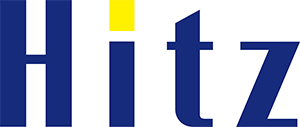
Meaning of Hitz
With the meaning of wanting to continue skipping HIT (business, products, etc.) aiming for Zenith (top), we have decided to write the name (abbreviation) as "Hitz" (HitachiZosen).
Design concept
It is a word mark with a readable function with the motif of Hitachi Zosen's (abbreviation) name "Hitz".
In a word, the image message to be carried is "dignified intelligence".
This is inevitable for Hitachi Zosen's product line, which is backed by advanced and advanced technology, and can be said to be an irreplaceable asset that should be inherited in the future.
Most of the simple and powerful typefaces, which are based on blue and consist of vertical and horizontal lines with strong contrast, are processed with straight lines, expressing the power of Hitachi Zosen's solid advanced technology.
In addition to expressing the hardware aspect of technological capabilities, the design as a whole exudes a youthful softness, and conveys the image of Hitachi Zosen's today's and tomorrow's human power and intellectual modernity.
The yellow dot on the "i" symbolizes the sincere, passionate and challenging "heart = will" and enthusiasm of the people who will be responsible for Hitachi Zosen's tomorrow.